Published on October 20, 2023, by Coyglow Editorial Studio — 2 min read
Placement Is a Map, Not Face Correction
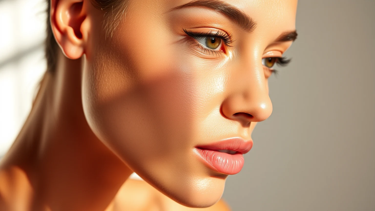
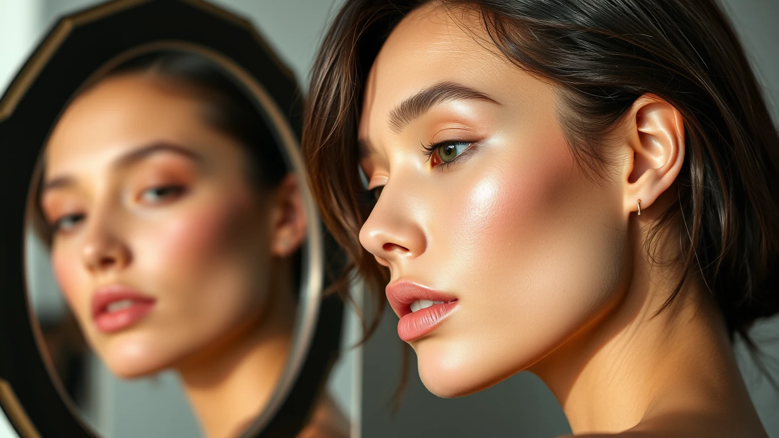
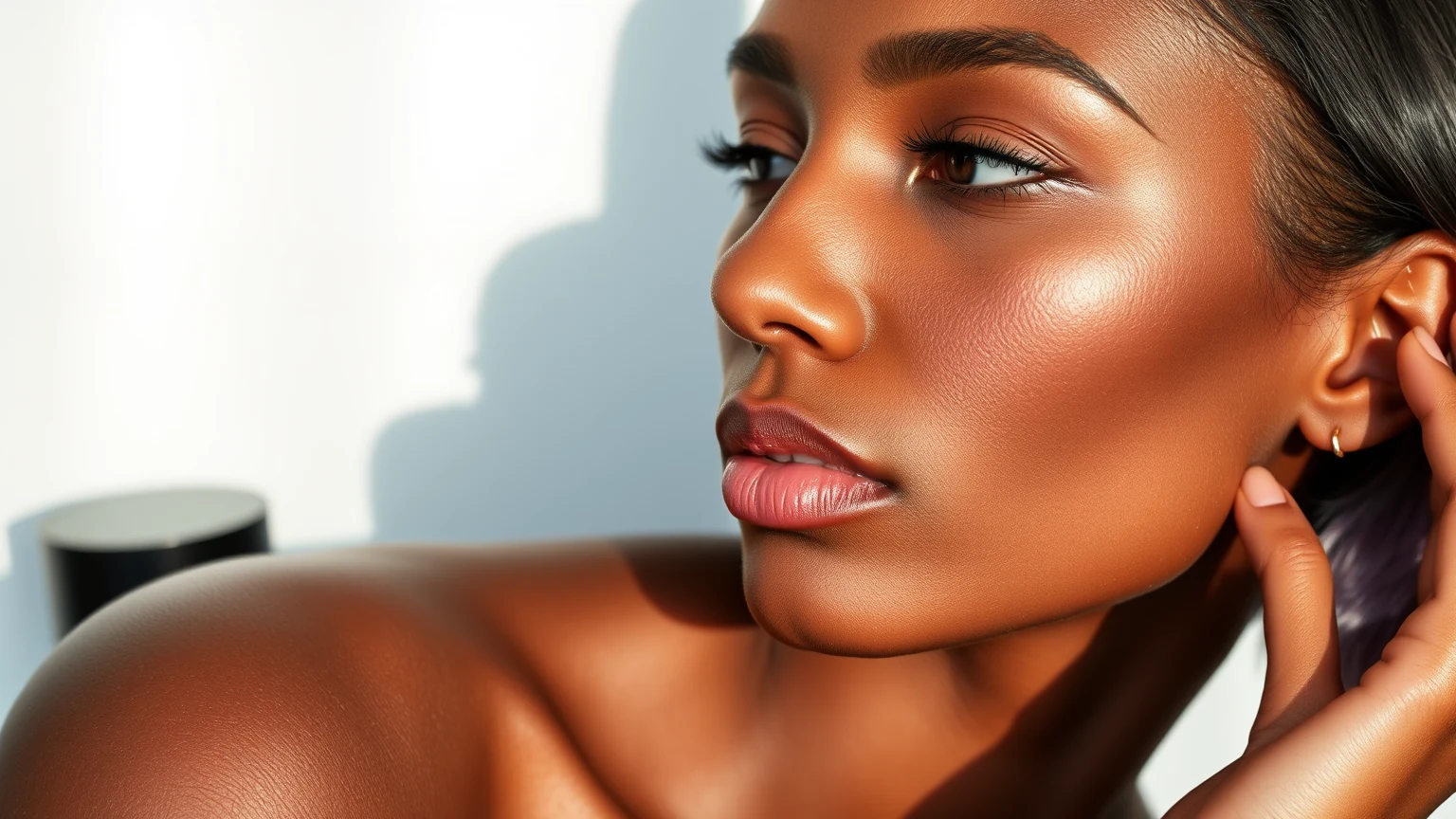
Blush placement changes where color enters the composition of a look. It can sit near the center, travel outward, connect toward the temple, or remain as a small point. These are visual maps, not promises to lift, slim, widen, or correct a face. Choose the relationship you want among cheek, eye, lip, and base.
Hold the Shade and Format Still
Use the same product, shade, tool, and approximate amount when comparing placements. If color, texture, and map change together, the result cannot explain whether another shade is needed. Keeping the variables stable lets placement answer its own question before the shelf expands through a color problem that may actually be a composition problem.
Begin With the Smallest Visible Area
Place a modest amount in the intended zone, then view both cheeks and the whole face before extending it. The goal is not to prescribe one universally flattering position. It is to make the edge, direction, and relationship to the rest of the makeup visible while there is still room to decide whether the map is complete.
Let the Format Change the Technique, Not the Promise
Cream, powder, liquid, balm, and stain formats may ask for different tools and current product directions. Read those first. Do not convert texture into a universal outcome such as natural, controlled, seamless, or long-wearing. Format describes how the color enters the look; the completed result still depends on the exact product, amount, base, and hand.
Compare in the Light and Look That Matter
View the placement with the intended lip, eye, base, clothing, and primary light. A map that feels strong on a bare face may become balanced once the rest of the color story is present, or the reverse. Context should be included before the shade is rejected. Screens and photographs remain useful references, not exact color replicas.
Save the Map in Plain Language
Record the product, amount, tool, starting point, direction, and the role the cheek color played in the whole look. “Soft center color with a stronger lip” is more reusable than “good blush.” Coyglow preserves the design logic so a future shade comparison begins from knowledge rather than another purchase made to solve an unnamed placement question.
About Coyglow Editorial Studio
The Coyglow Editorial Studio connects skin, makeup, nails, and everyday decision-making with clarity and restraint.