Published on August 28, 2026, by Coyglow Editorial Studio — 1 min read
Begin With What Is Visible
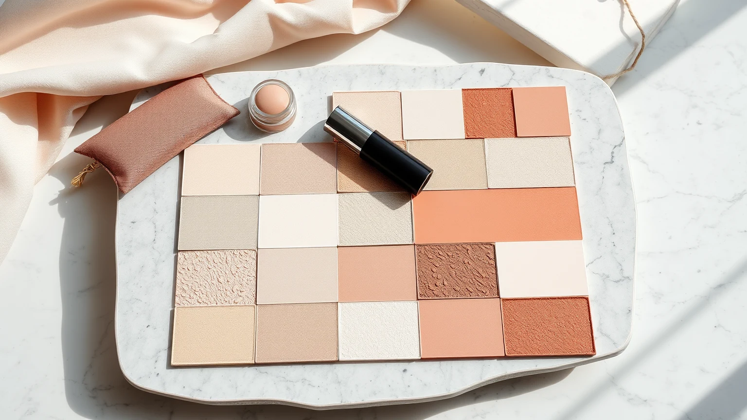
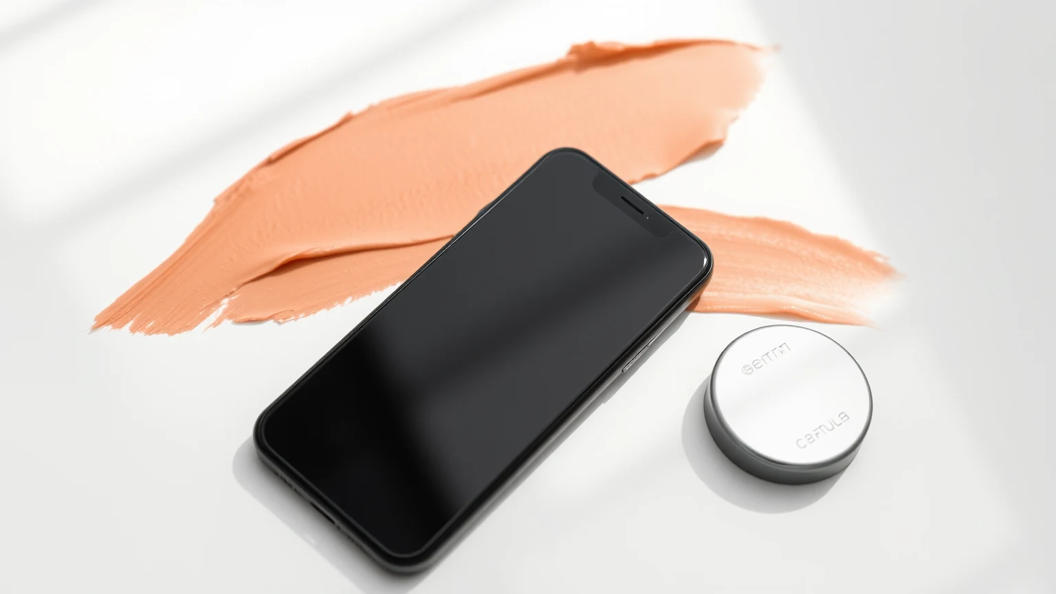
Name the product, surface, amount, scale, light, angle, and time of capture when those details are provided. Then describe only what the frame contains: a peaked dollop, a fluid trail, a sharp edge, visible particles, translucency, or reflected light. Observation becomes clearer when interpretation waits.
Use Scale Carefully
A measured applicator or stated amount offers useful scale; an anonymous fingertip or prop does not. Crop and magnification can make the same sample appear dense or expansive. Before comparing two images, check whether the scale and surface are genuinely comparable.
Do Not Turn Appearance Into Feel
A still image cannot establish slip, cushion, spread, absorption, comfort, wear, or compatibility. Even a sharp swatch edge may come from the tool, pressure, timing, or surface. Let the photograph answer visual questions and take experience questions to directions, demonstrations, and contextual reviews.
Compare Like With Like
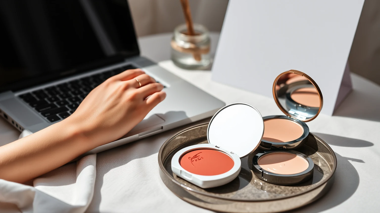
The strongest visual comparison holds amount, surface, movement, elapsed time, lighting, camera, crop, and editing steady. If those conditions differ, use the images as separate references rather than evidence that one product behaves differently from another.
The Coyglow Edit
A good texture image should leave you with a better next question. Read the visible form, notice the capture choices, and keep the product page close for everything the photograph cannot responsibly tell you.
About Coyglow Editorial Studio
Coyglow Editorial Studio writes beauty guidance across skin, makeup, nails, routine design, product literacy, creator culture, and community commerce.