Published on August 28, 2026, by Coyglow Editorial Studio — 1 min of reading
Coyglow Take
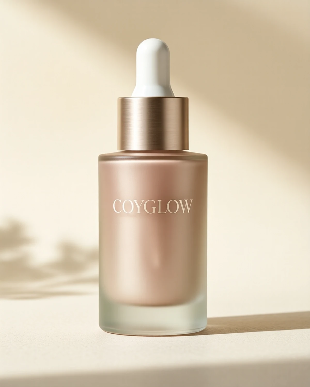
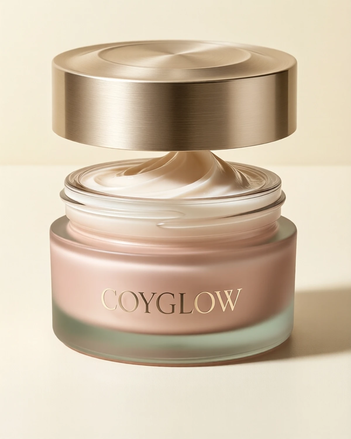
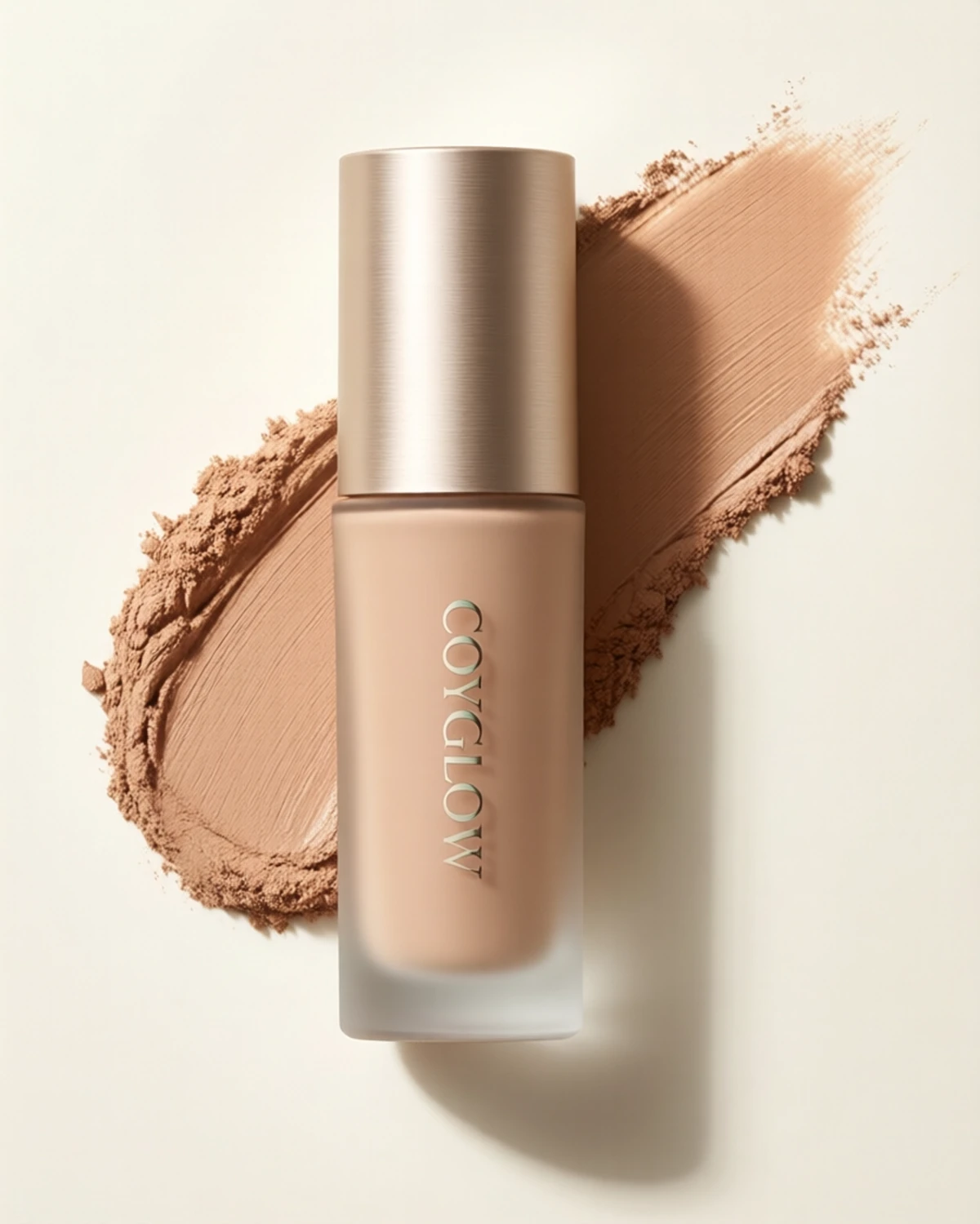
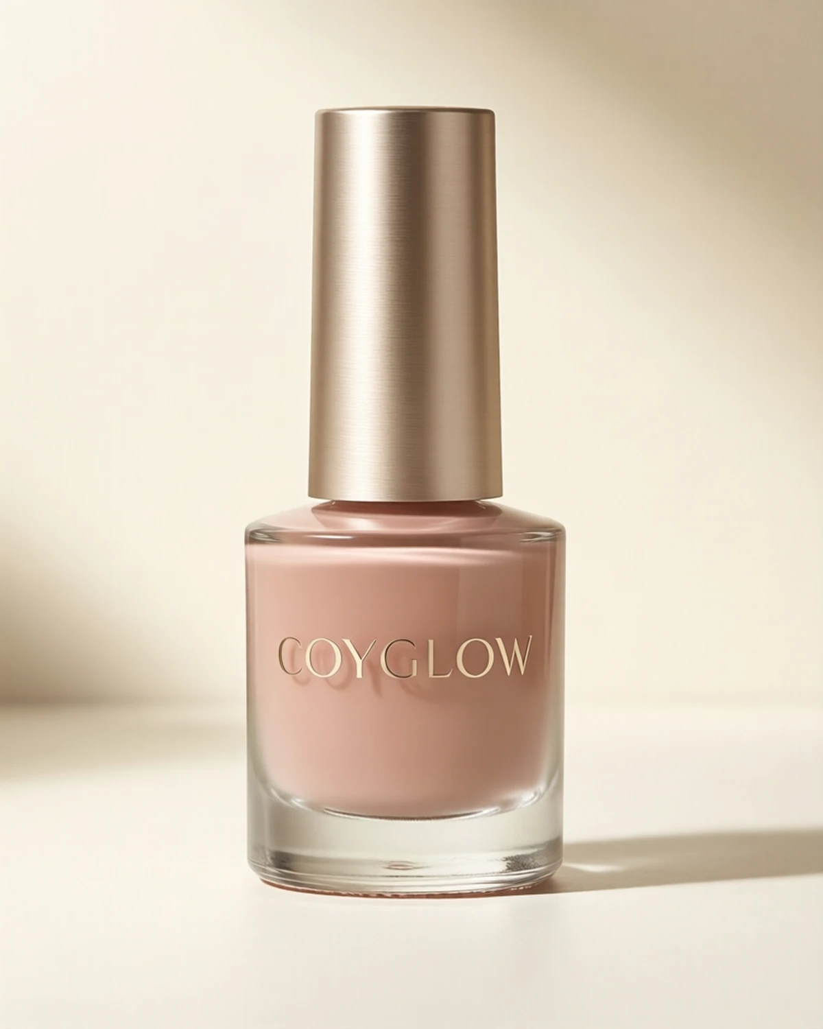
Product texture photos are useful when they answer four questions: how thick it looks, how it spreads, how the surface finishes, and whether the photo shows a real routine context.
Look For Scale
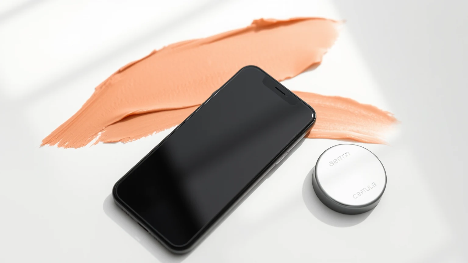
A swatch without scale can make every product look similar. A useful photo shows the amount, the surface, and enough context to judge whether the texture is gel, cream, balm, oil, polish, or powder.
Watch The Edge
The edge of a swatch tells more than the center. A sharp edge can suggest a thicker texture. A disappearing edge may suggest a lighter spread. For lip and cheek products, the edge also shows how easy blending might be.
Separate Shine From Slip
A shiny photo does not always mean the product feels slippery, and a matte photo does not always mean it feels dry. Use the photo as a starting point, then confirm with texture words, reviews, and routine placement.
Prefer Real Context
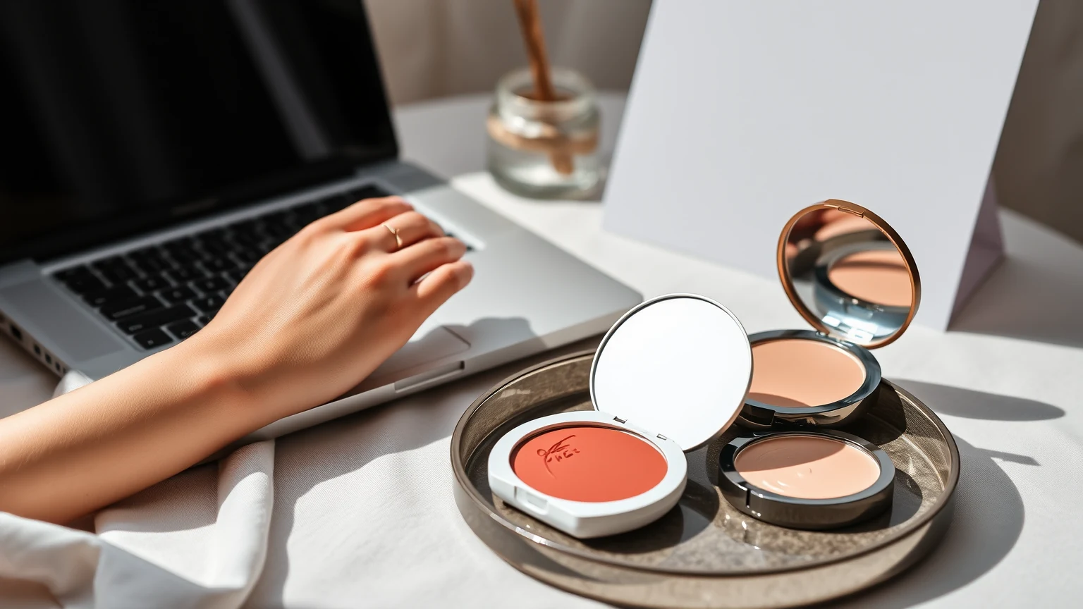
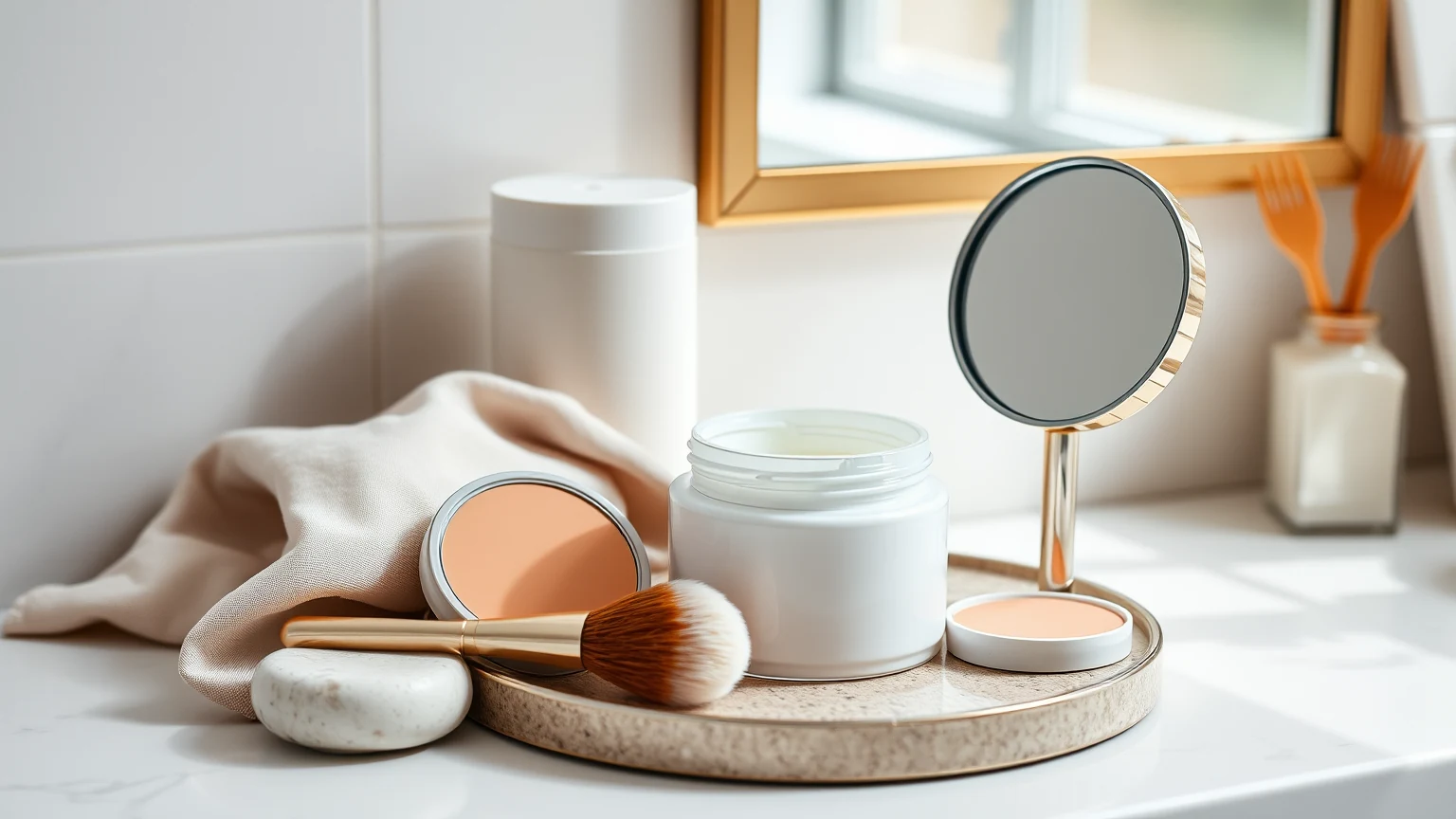
A product beside SPF, base, nails, or a hand tells a better story than a perfect object shot alone. Coyglow wants texture photos that help a shopper imagine timing, not just packaging.
Sources
- Coyglow Amber Day Serum — Proactive content commerce path for how to read beauty texture photos
- Coyglow Balm-Cream Moisturizer — Proactive content commerce path for how to read beauty texture photos
- Coyglow Soft-Matte Skin Tint — Proactive content commerce path for how to read beauty texture photos
- Coyglow Glass Gloss Top Coat — Proactive content commerce path for how to read beauty texture photos
About Coyglow Editorial Studio
Coyglow Editorial Studio writes beauty guidance across skin, makeup, nails, routine design, product literacy, creator culture, and community commerce.