Short answer
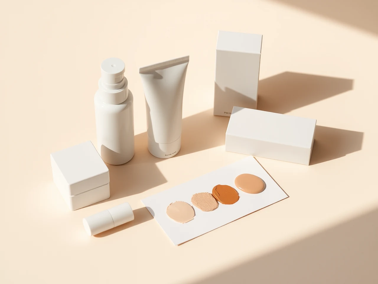
A swatch is a small visible sample of a cosmetic used to compare color, opacity, texture or finish. It can help narrow choices, but it cannot prove how a product will wear, feel or look in every application. The surface, amount, tool, lighting and camera settings all affect what the swatch shows.
Make the comparison readable
Define the question first. For foundation, compare depth, undertone and the visible edge using samples from the same formula. For lip or cheek color, separate hue from opacity and finish. For nail lacquer, distinguish the first wet appearance from the finish observed after following the product's directions. Use equal, controlled amounts where practical and record whether the sample was one pass or built in layers.
View swatches in neutral daylight and in another light relevant to the intended setting. Keep camera processing and white balance consistent when photographs are used. Do not smooth the image, increase saturation or crop away the comparison edge. A product photo supplied by a brand and a customer swatch can offer different context, but neither should be treated as universal proof.
Know what is missing
A forearm or tile swatch does not reproduce lips, eyelids, the full face or nails. It does not establish transfer resistance, duration, comfort or compatibility with another product. Use cosmetics only on areas permitted by their labels; do not place lip or nail color near the eyes to create a comparison.
Common questions
Is a thicker swatch more accurate? Not automatically. It shows a different amount. State the application instead of presenting it as the single true color.
Can a swatch guarantee a shade match? No. It is one comparison point that should be checked in the intended application context.
Sources: FDA guidance for using cosmetics safely, FDA Cosmetics Labeling Guide, and FDA color-additive information.